Simply Thai
2013
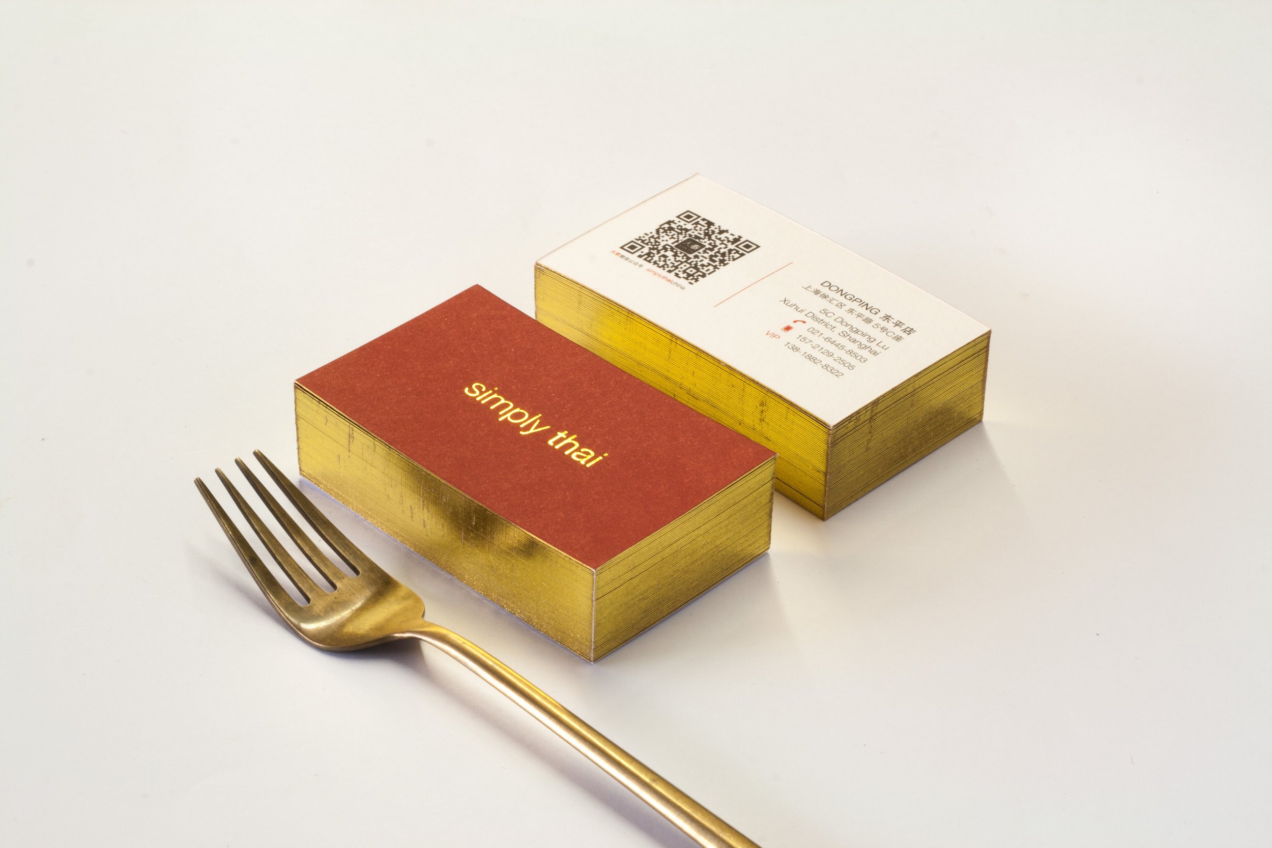
" simply | thai "
In 2013, Simply Thai, the very first Thai restaurant in Shanghai decided to rebrand itself for the first time since its 1st launch 15 years earlier.
_
Branding, Environmental Graphic


_
Firstly, a very strong recognition or sense of Thai-ness is required since most of the customers are Chinese people and expats who live in Shanghai. But at the same time, the restaurant should show some individual character of the brand as well. Our strategy was to use the potential of the name Simply Thai as a core idea, both in the interior design and the graphic design.
We redefined these 2 words in the name differently and separately.
Simply = modern, western, minimalism, simplicity
Thai = traditional, eastern, maximalism, complexity
Both words were used throughout the design process under the “collage” technique which is the way to attach two things together without simplifying it, so the final outcome would have the obvious Thai flavor combined with the atmosphere of the western/modern look which becoming the core idea for IF & InFO to use for all Simply Thai later branches.

_
2017
“ The younger Simply Thai ”
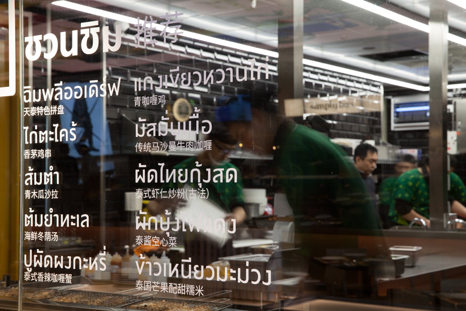
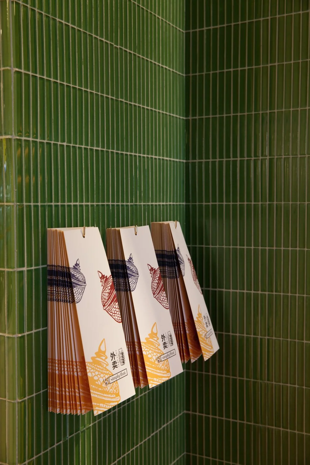
In 2017, Simply Thai has decided to expand their business with 2 main strategies; expand out of Shanghai to nearby cities such as Suzhou & Hangzhou and aimed for the younger target. With that in mind, the overall look of the brand has shifted to be brighter and more colorful.
The brand mark was added for the logo. Sketchy style of the Thai elements were included in the art direction to loosen up the earlier version of itself. Furthermore, we also invited Thai renowned artists to be our guest to provide a signature artworks for the ceiling in the restaurants.


Brand Identity → InFO & After Design
Environmental Graphic → InFO & After Design
Interior Designer → IF
Client → Simply the Group